Good labels are critical for making your plots accessible to a wider
audience. Ensure the axis and legend labels display the full variable name.
Use the plot title and subtitle to explain the main findings.
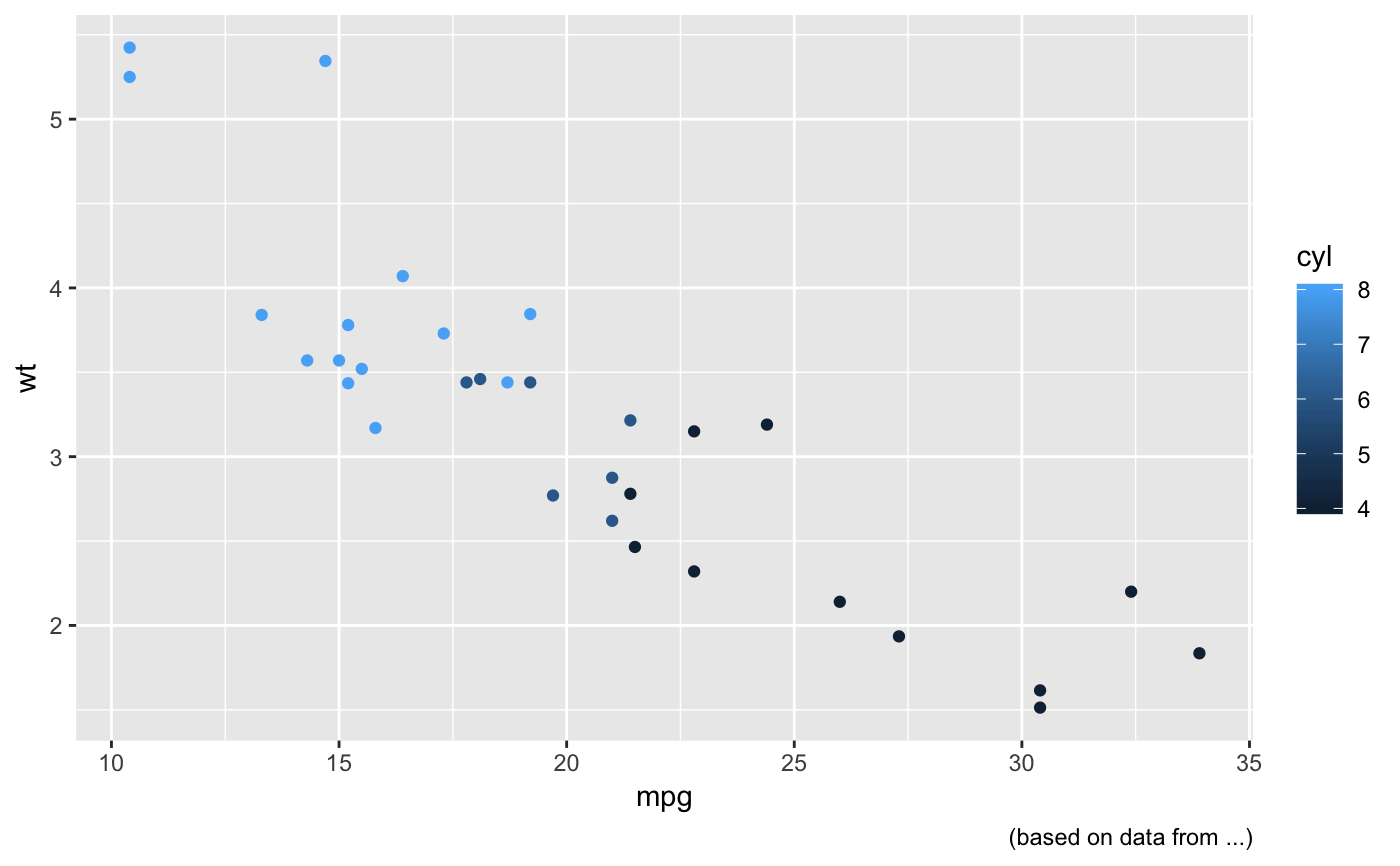
It's common to use the caption to provide information about the
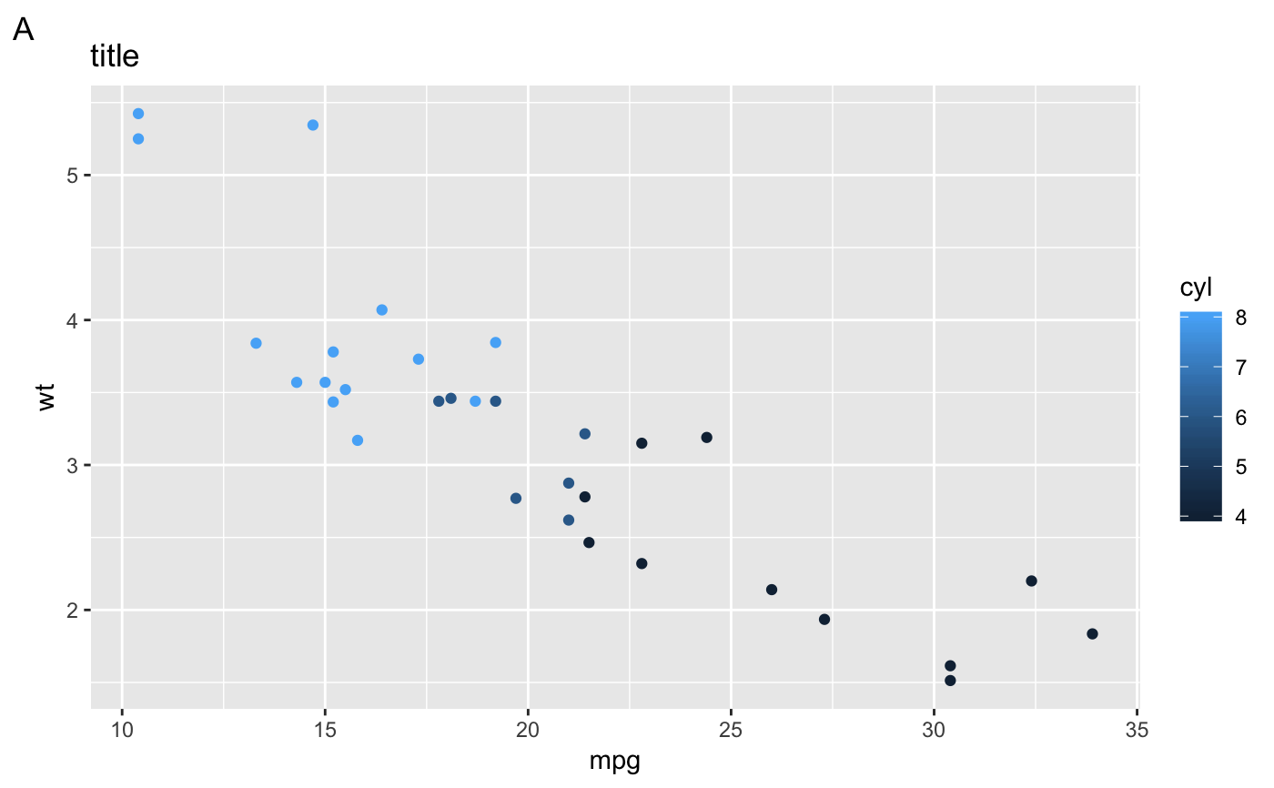
data source. tag can be used for adding identification tags.
labs(...)

xlab(label)

ylab(label)

ggtitle(label, subtitle = NULL)
Arguments
| ... | A list of new name-value pairs. The name should either be an aesthetic, or one of "title", "subtitle", "caption", or "tag". |
|---|---|
| label | The text for the axis, plot title or caption below the plot. |
| subtitle | the text for the subtitle for the plot which will be
displayed below the title. Leave |
Details
You can also set axis and legend labels in the individual scales (using
the first argument, the name). I recommend doing that if you're
changing other scale options.
Examples
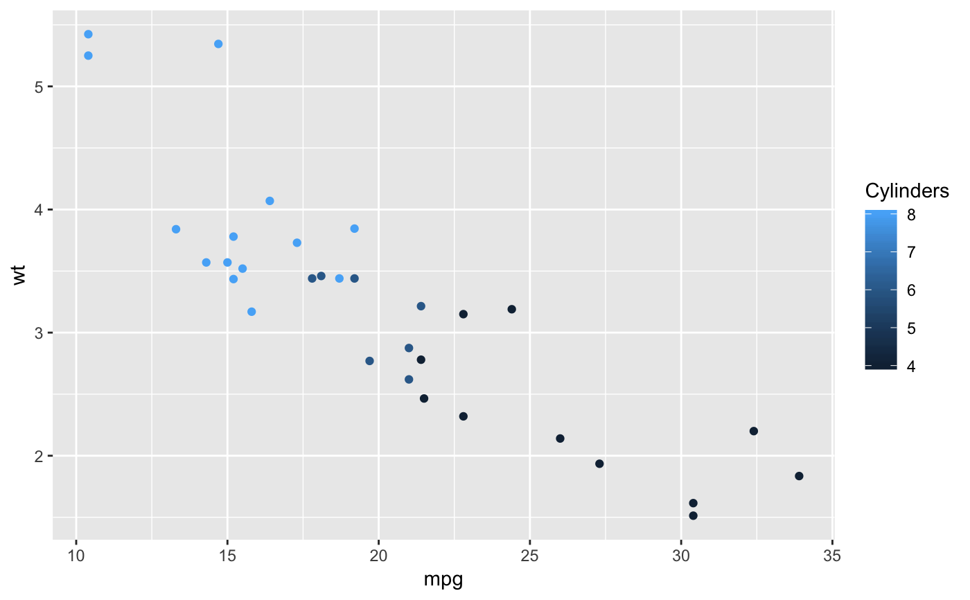
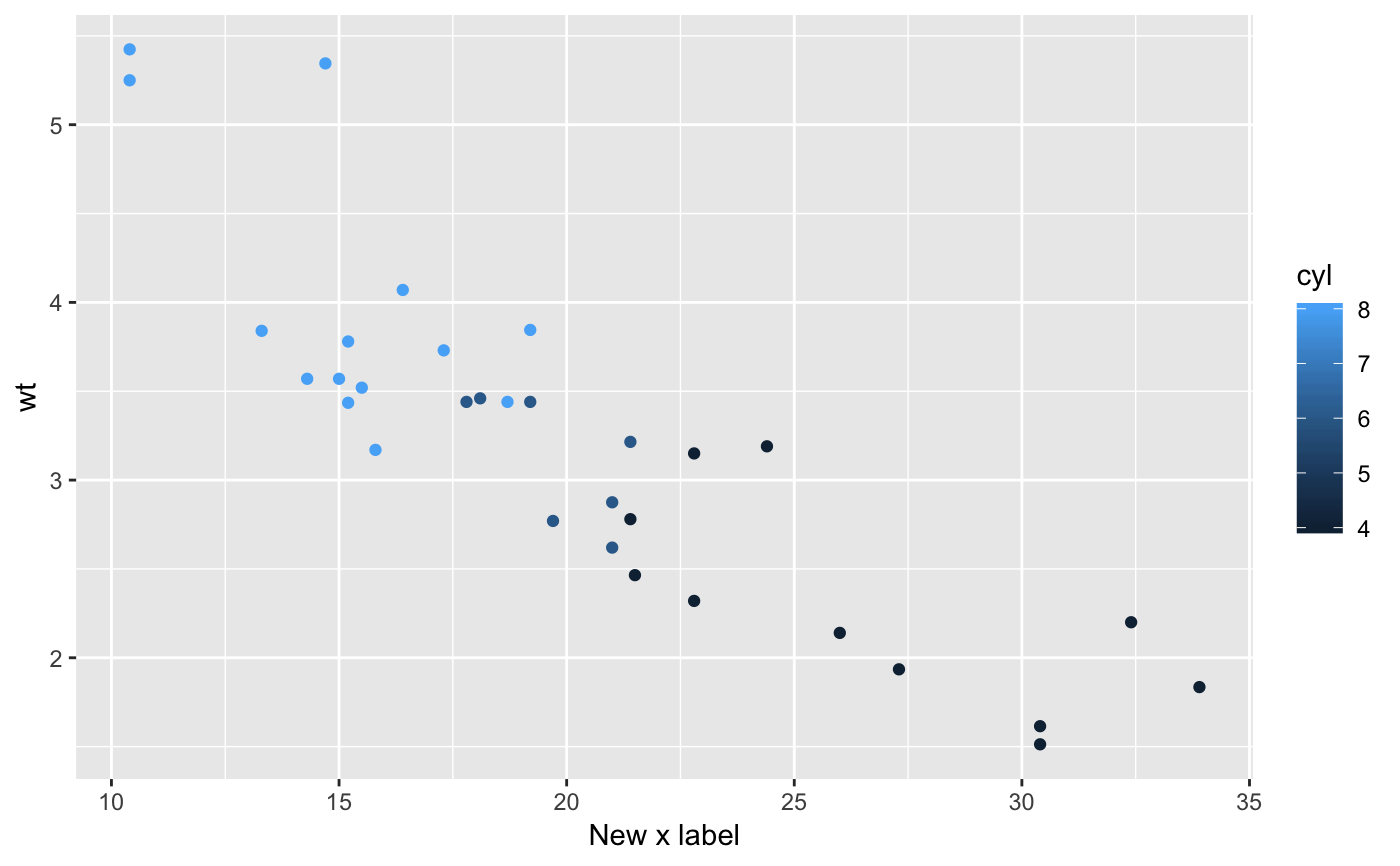
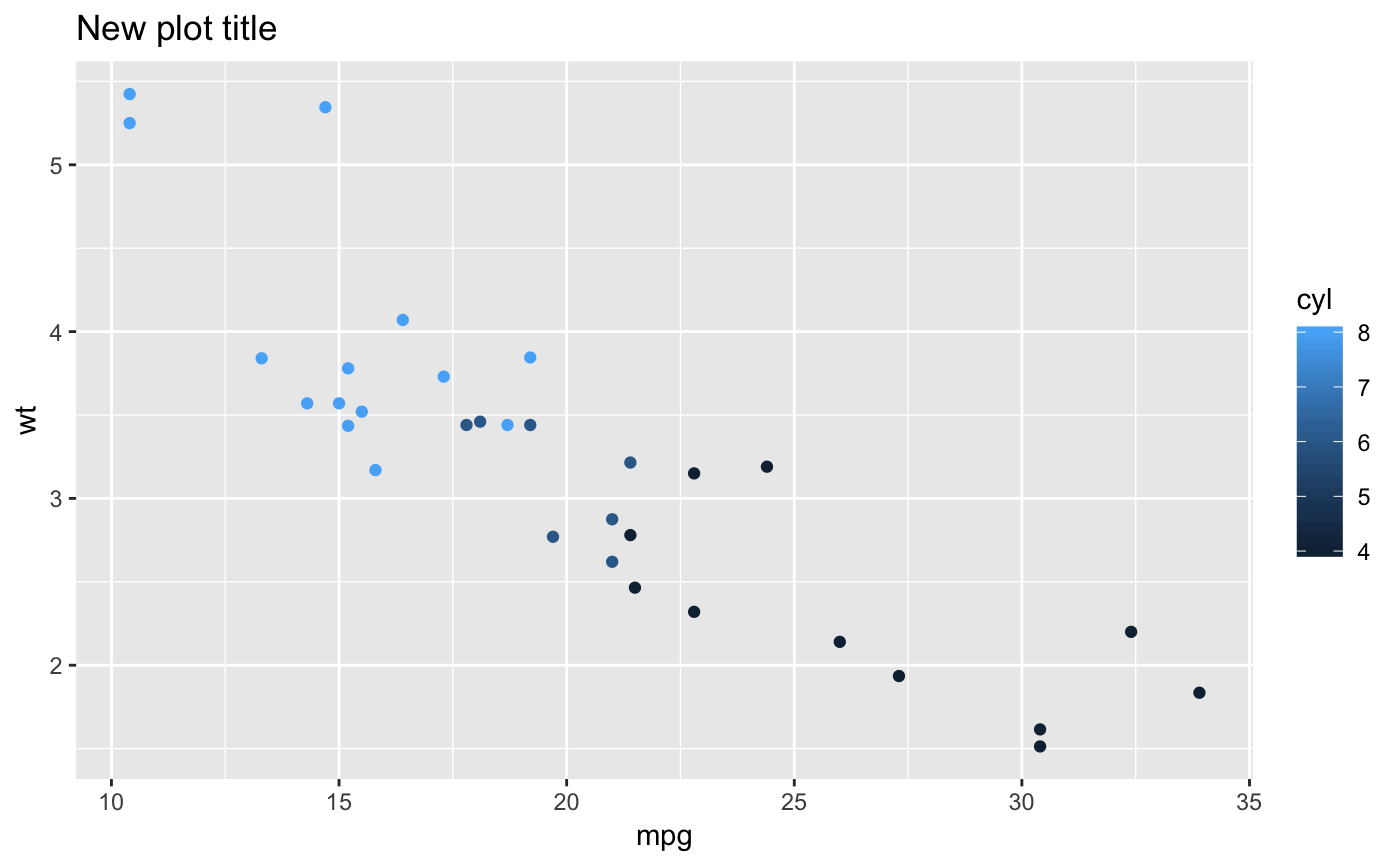
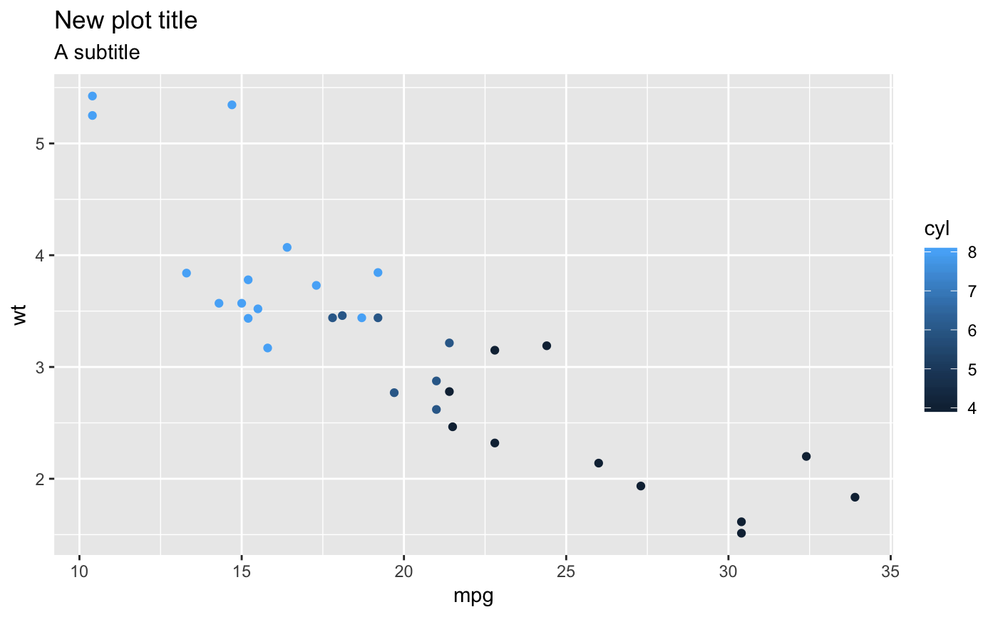
p + labs(x = "New x label")# The plot title appears at the top-left, with the subtitle # display in smaller text underneath it p + labs(title = "New plot title")p + labs(title = "New plot title", subtitle = "A subtitle")# The caption appears in the bottom-right, and is often used for # sources, notes or copyright p + labs(caption = "(based on data from ...)")# The plot tag appears at the top-left, and is typically used # for labelling a subplot with a letter. p + labs(title = "title", tag = "A")
