There are two types of bar charts: geom_bar makes the height of the
bar proportional to the number of cases in each group (or if the
weight aesthetic is supplied, the sum of the weights). If you want the
heights of the bars to represent values in the data, use
geom_col instead. geom_bar uses stat_count by
default: it counts the number of cases at each x position. geom_col
uses stat_identity: it leaves the data as is.
geom_bar(mapping = NULL, data = NULL, stat = "count",
  position = "stack", ..., width = NULL, binwidth = NULL, na.rm = FALSE,
  show.legend = NA, inherit.aes = TRUE)

geom_col(mapping = NULL, data = NULL, position = "stack", ...,
  width = NULL, na.rm = FALSE, show.legend = NA, inherit.aes = TRUE)

stat_count(mapping = NULL, data = NULL, geom = "bar",
  position = "stack", ..., width = NULL, na.rm = FALSE,
  show.legend = NA, inherit.aes = TRUE)
Arguments
| mapping | Set of aesthetic mappings created by |
|---|---|
| data | The data to be displayed in this layer. There are three options: If A A |
| position | Position adjustment, either as a string, or the result of a call to a position adjustment function. |
| ... | Other arguments passed on to |
| width | Bar width. By default, set to 90% of the resolution of the data. |
| binwidth |
|
| na.rm | If |
| show.legend | logical. Should this layer be included in the legends?
|
| inherit.aes | If |
| geom, stat | Override the default connection between |
Details
A bar chart uses height to represent a value, and so the base of the bar must always be shown to produce a valid visual comparison. Naomi Robbins has a nice article on this topic. This is why it doesn't make sense to use a log-scaled y axis with a bar chart.
By default, multiple bars occupying the same x position will be stacked
atop one another by position_stack(). If you want them to be dodged
side-to-side, use position_dodge() or position_dodge2(). Finally,
position_fill() shows relative proportions at each x by stacking the bars
and then standardising each bar to have the same height.
Aesthetics
geom_bar understands the following aesthetics (required aesthetics are in bold):
xyalphacolourfillgrouplinetypesize
Learn more about setting these aesthetics in vignette("ggplot2-specs")
Computed variables
- count
number of points in bin
- prop
groupwise proportion
See also
geom_histogram() for continuous data,
position_dodge() and position_dodge2() for creating side-by-side
barcharts.
stat_bin(), which bins data in ranges and counts the
cases in each range. It differs from stat_count, which counts the
number of cases at each x position (without binning into ranges).
stat_bin() requires continuous x data, whereas
stat_count can be used for both discrete and continuous x data.
Examples
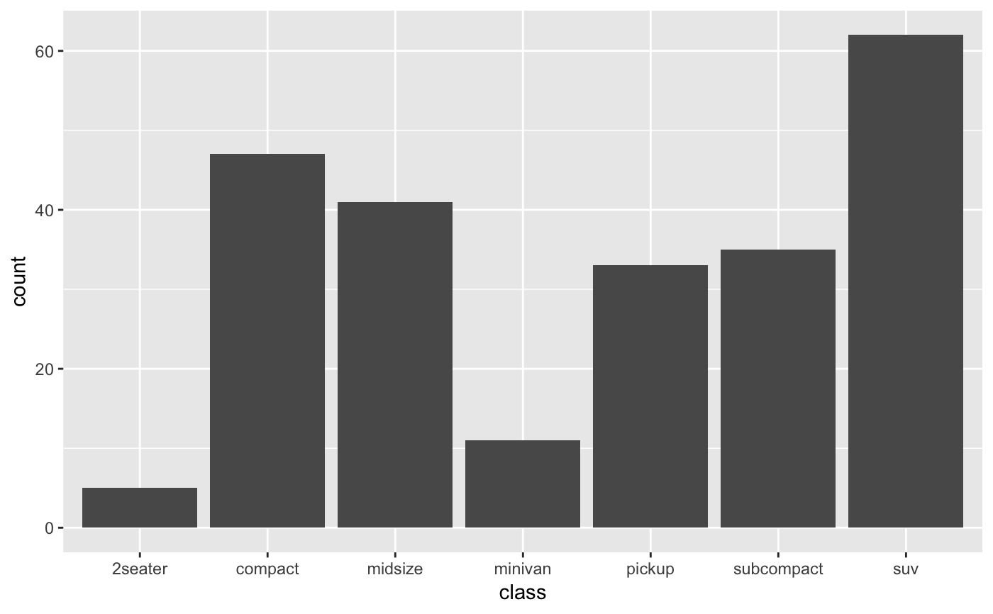
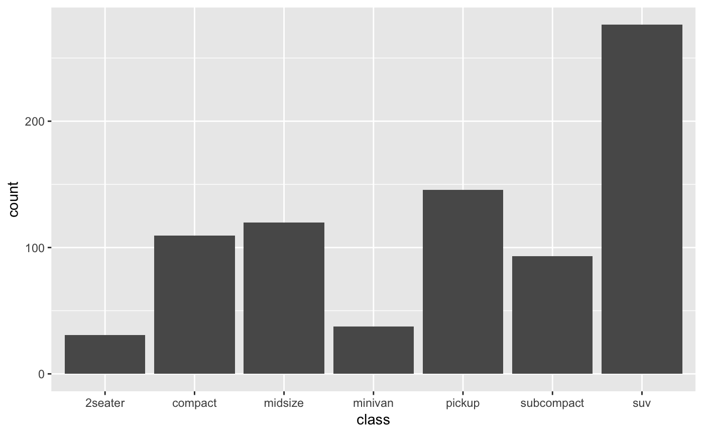
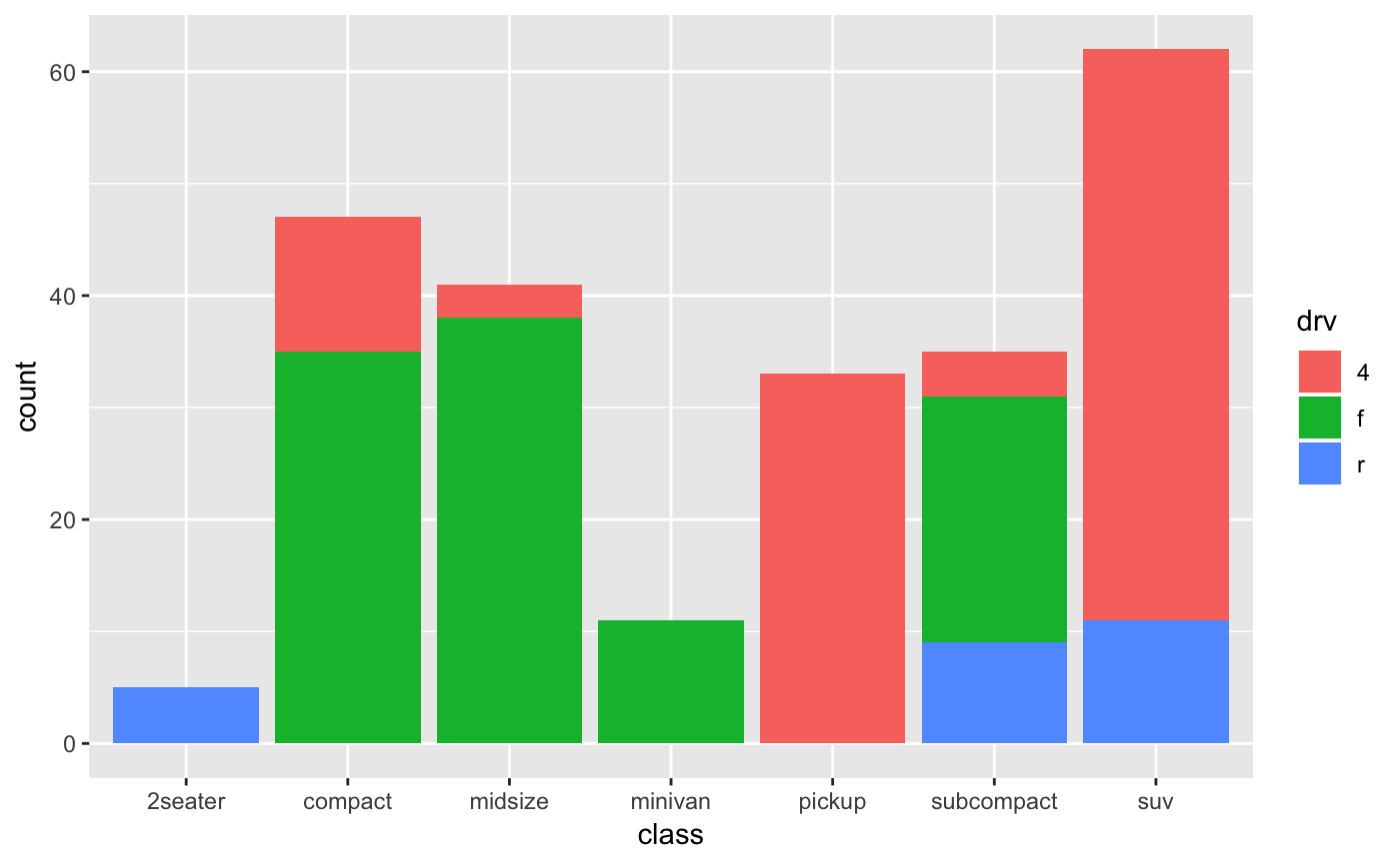
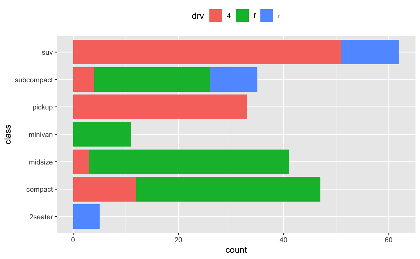
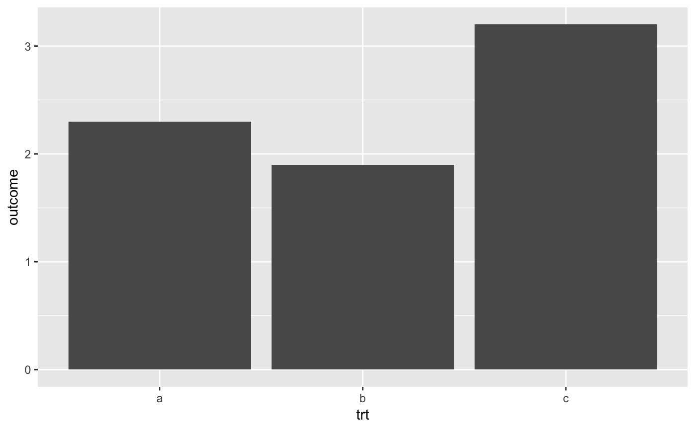
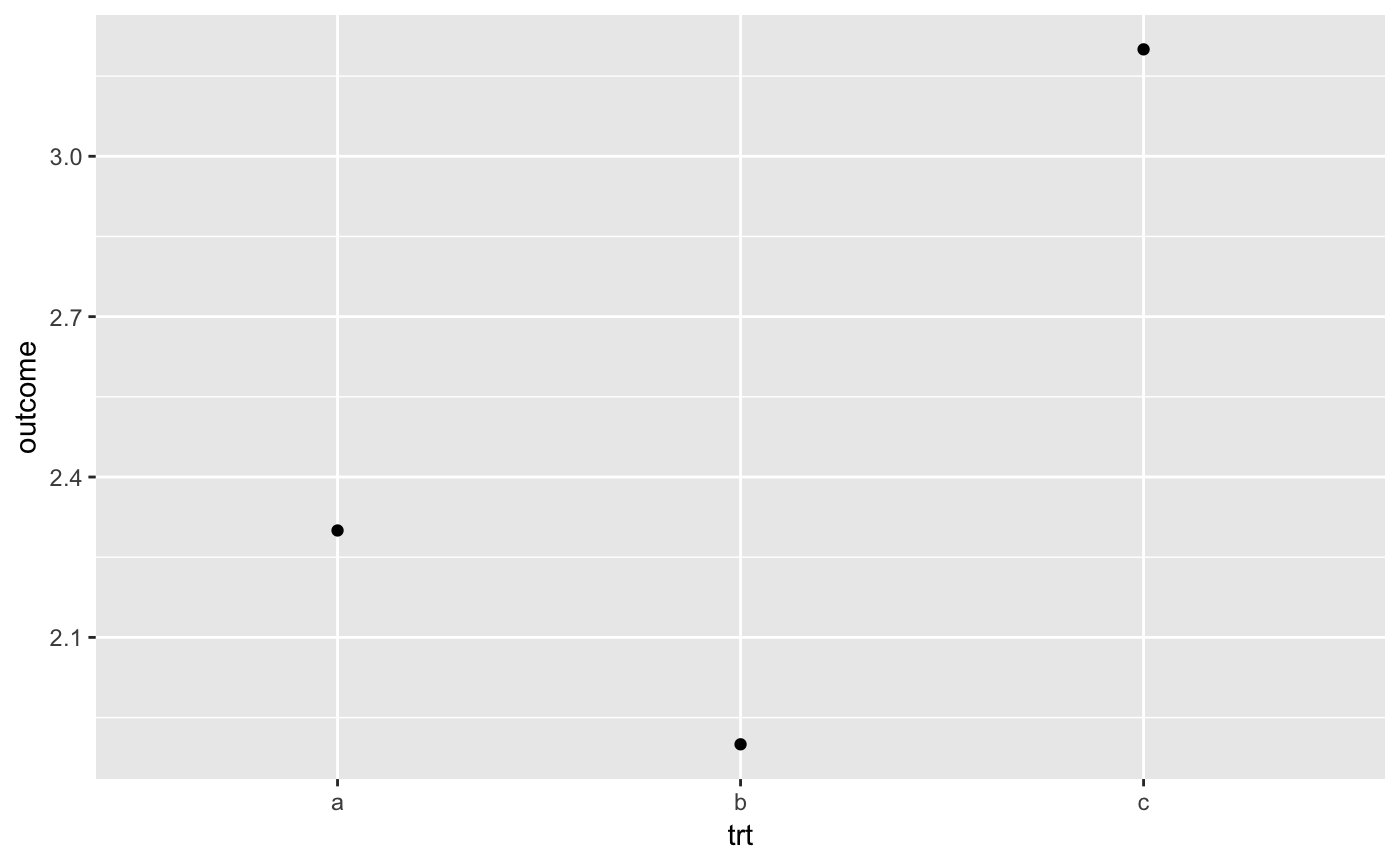
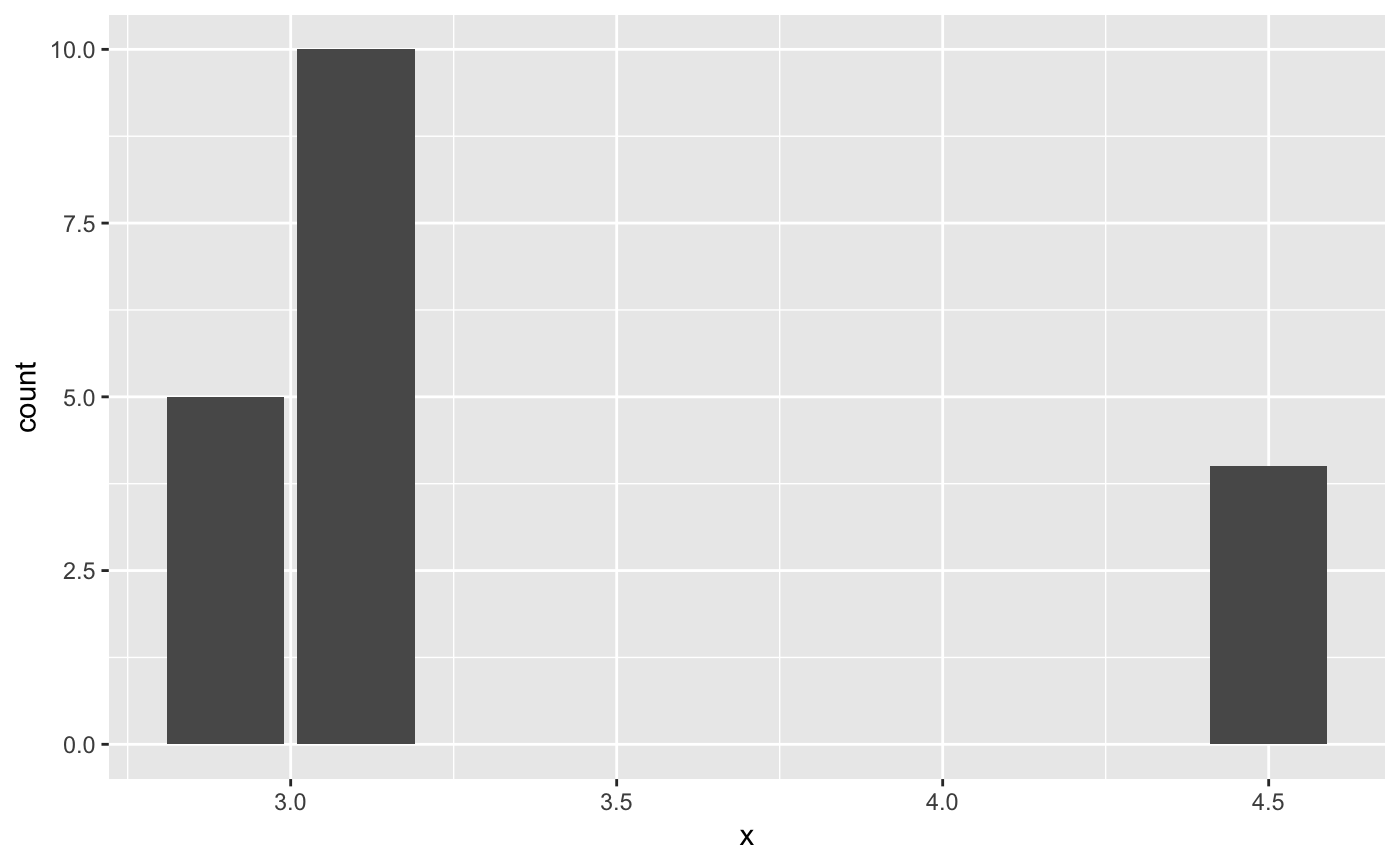
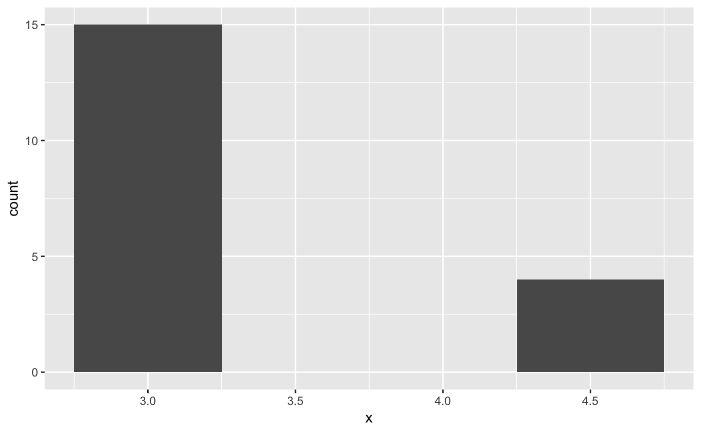
# geom_bar is designed to make it easy to create bar charts that show # counts (or sums of weights) g <- ggplot(mpg, aes(class)) # Number of cars in each class: g + geom_bar()# Bar charts are automatically stacked when multiple bars are placed # at the same location. The order of the fill is designed to match # the legend g + geom_bar(aes(fill = drv))# If you need to flip the order (because you've flipped the plot) # call position_stack() explicitly: g + geom_bar(aes(fill = drv), position = position_stack(reverse = TRUE)) + coord_flip() + theme(legend.position = "top")# To show (e.g.) means, you need geom_col() df <- data.frame(trt = c("a", "b", "c"), outcome = c(2.3, 1.9, 3.2)) ggplot(df, aes(trt, outcome)) + geom_col()# But geom_point() displays exactly the same information and doesn't # require the y-axis to touch zero. ggplot(df, aes(trt, outcome)) + geom_point()# You can also use geom_bar() with continuous data, in which case # it will show counts at unique locations df <- data.frame(x = rep(c(2.9, 3.1, 4.5), c(5, 10, 4))) ggplot(df, aes(x)) + geom_bar()
